This creates five diagnostic plots:
Screeplot: The top
ksingular values ofL.Better screeplot: its singular values
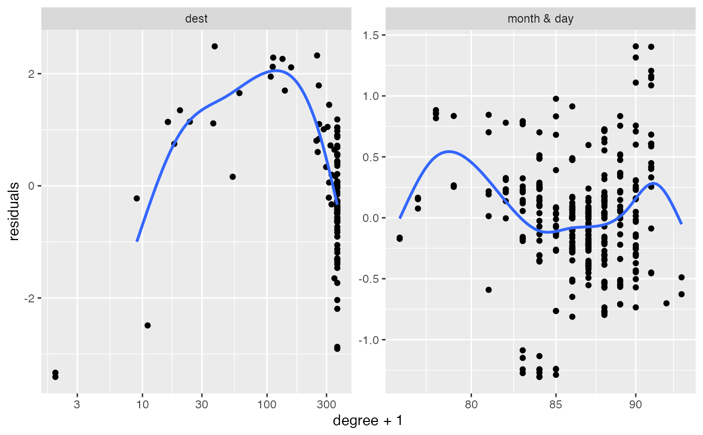
2:k(because the first one is usually dominant and difficult to see an elbow past it).A "localization plot" which is very similar (maybe exact?) to this stuff; for each row (and column) compute its degree and its leverage score. Take the log of both. Fit a linear model
log(leverage)~log(degree)and plot the residuals againstlog(degree). If there is localization, I suspect that there will be a big curl on the right side.Pairs plot of
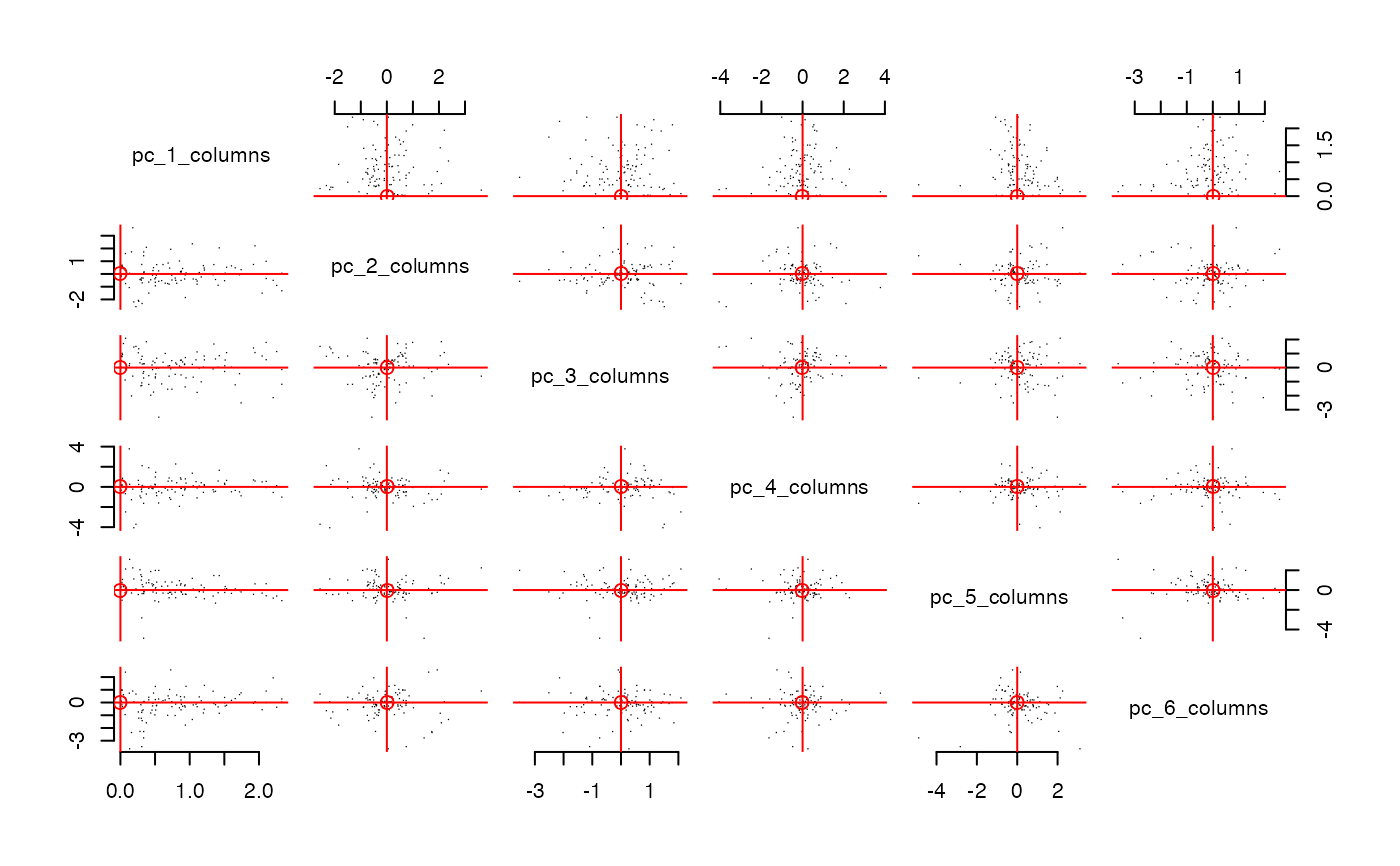
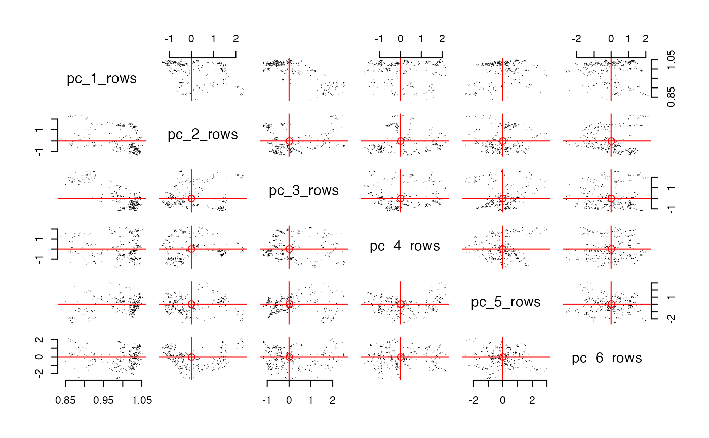
row_features. This is the plot emphasized in the varimax paper. In these example plots below, we do not see very clear radial streaks.A pairs plot for
column_features. In both pairs plots, if there are more than 1000 points, then the code samples 1000 points with probability proportional to their leverage scores. It will plot up tok=10dimensions. Ifkis larger, then it plots the first 5 and the last 5.
Usage
# S3 method for pc
plot(pcs)Examples
library(nycflights13)
pcs = pca_count(1 ~ (month & day)*(dest), flights, k = 6)
plot(pcs)
 #> Press [Enter] to continue to the next plot...
 #> Press [Enter] to continue to the next plot...
#> `geom_smooth()` using formula = 'y ~ s(x, bs = "cs")'
#> Press [Enter] to continue to the next plot...
#> `geom_smooth()` using formula = 'y ~ s(x, bs = "cs")'
 #> Press [Enter] to continue to the next plot...
 #> Press [Enter] to continue to the next plot...